Getting ready for some gorgeous family photos this fall? You're definitely in the right spot! I know how overwhelming it can be to figure out what everyone should wear – especially when you want those pictures to look absolutely amazing.
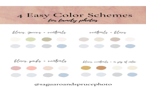
The secret sauce? It's all about picking the right color palette. And here's what I've learned after years of family photo sessions: your location makes a huge difference in which colors will actually work. What looks incredible in a pumpkin patch might totally disappear against a forest backdrop.
So I've put together beautiful color combinations, organized by where you're planning to take those precious family memories. Trust me, this approach will save you so much stress!

Why Your Photo Spot Changes Everything
Think about it this way – if you're wearing earthy browns and greens in a dense forest, you might just blend right into the trees. But those same colors would pop beautifully in an open field or against a barn.
That's why I always tell families to pick their location first, then choose their colors. It makes the whole process so much easier, and your photos will look way more professional.
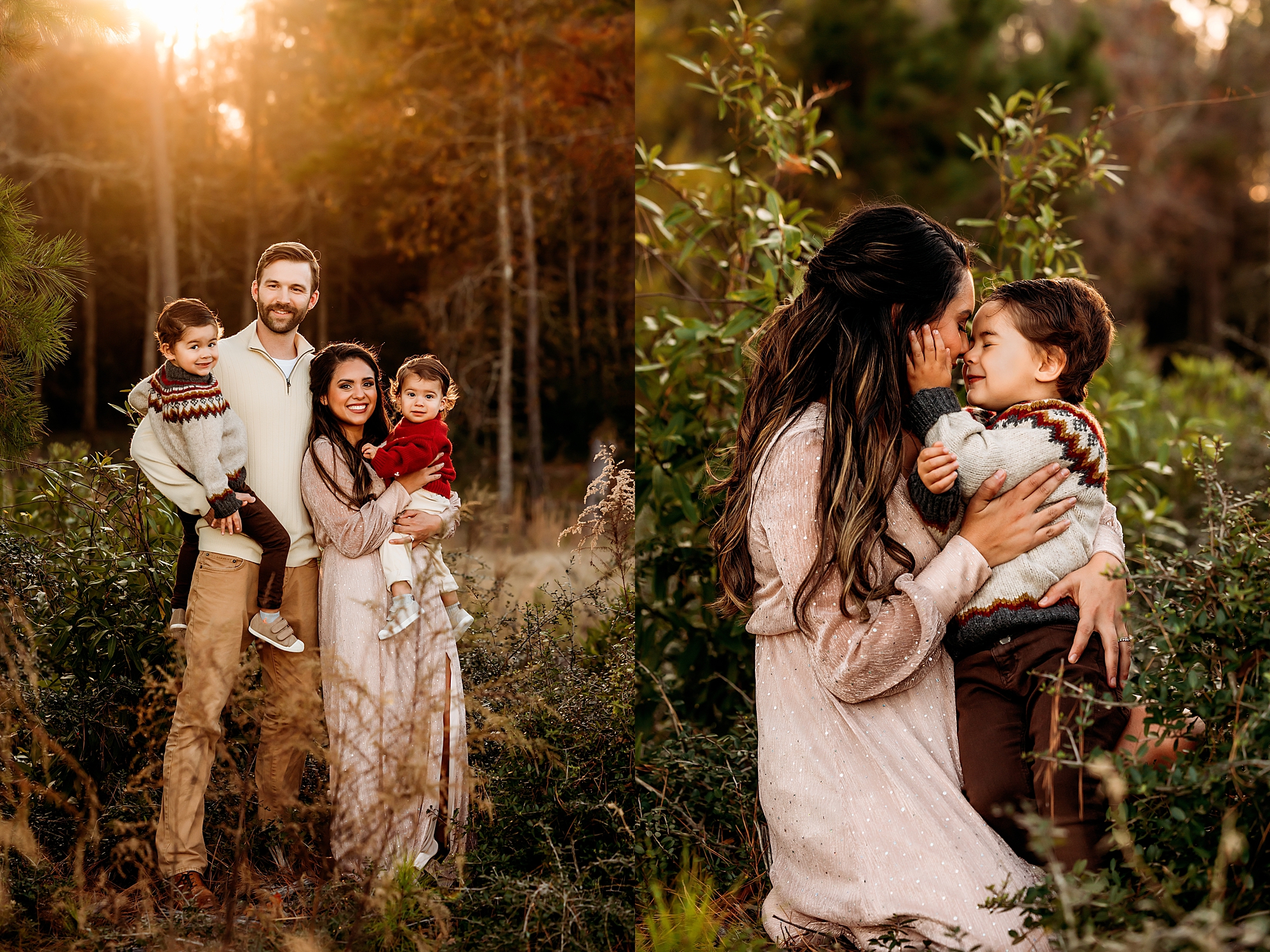
Forest and Woodland Settings
The Cozy Library Look
This palette is perfect when you're shooting in those deep, shady woods with lots of evergreens. Think rich, sophisticated colors that won't get lost against dark tree trunks.
Here's what works beautifully:
- Deep wine-colored sweaters
- Cream or off-white cardigans
- Rich brown boots and accessories
- Muted olive green pieces
- Charcoal gray accents
The magic happens when you mix different textures – wool sweaters, corduroy pants, leather boots. Just keep it to about three colors per person, and you'll nail that cozy, put-together vibe.
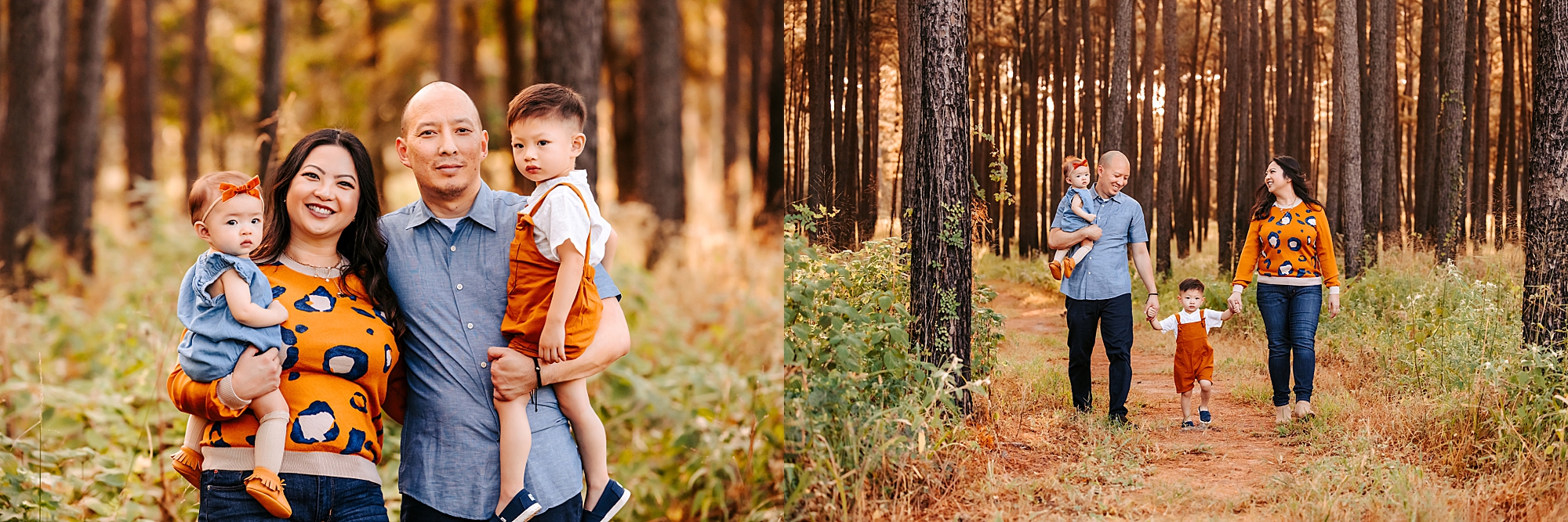
Golden Autumn Glow
If you're lucky enough to catch those trees when they're all golden and orange, this palette will make you look like you stepped out of a fall magazine.
The winning combination:
- Burnt orange anything (seriously, it's magic)
- Mustard yellow sweaters
- Warm brown tones
- Soft cream or ivory
- Just a touch of forest green
Pro tip: Choose fabrics that catch the light a little bit. When that golden hour sun filters through the leaves, you want to glow right along with it.
Soft and Dreamy
This one's for when you want that romantic, fairy-tale feeling. It works especially well in woods where there are lots of fallen leaves on the ground.
Go for these gentle colors:
- Sage green (so pretty and calming)
- Dusty rose or mauve
- Warm beige and tan
- Soft lavender accents
- Natural leather tones
The key here is choosing softer fabrics and matte finishes. Skip anything too shiny or structured – you want everything to feel gentle and flowing.
City Parks and Urban Spaces
Clean and Classic
When you're dealing with city backdrops – think park benches, urban trees, maybe some cool architecture – you want colors that feel polished but still seasonal.
This combination never fails:
- Classic black (always elegant)
- Camel or tan coats
- Crisp white shirts
- Rich cognac leather
- Navy blue for depth
The beauty of this palette is how timeless it is. Your photos will still look stylish years from now, and these colors photograph beautifully whether it's sunny or cloudy.
Warm and Earthy
For a more relaxed city vibe, especially in parks with lots of fall foliage, try these warmer tones.
The mix that works:
- Terracotta or rust colors
- Golden yellow pieces
- Cream and off-white
- Warm brown suede or leather
- Muted orange accents
This palette gives you that effortless, bohemian feel while still looking polished enough for an urban setting. Plus, these colors are incredibly flattering on most skin tones.
Farm and Country Settings
Harvest Time Vibes
Pumpkin patches, apple orchards, old barns – these settings practically beg for rich, harvest-inspired colors.
Embrace the season with:
- Pumpkin orange (obviously!)
- Deep cranberry red
- Creamy whites
- Golden yellow
- Chocolate brown
Just remember you'll probably be walking on uneven ground, so comfortable shoes are a must. And maybe skip the all-white outfits – farm settings can be a little dusty!
Countryside Romance
For those wide-open country views and rolling hills, softer colors create the most beautiful contrast.
Try this gentle palette:
- Dusty pink or mauve
- Soft sage green
- Warm taupe
- Blush and rose tones
- Natural linen colors
These colors photograph like a dream against big skies and open landscapes. The soft tones won't compete with the natural beauty around you.
Waterfront Locations
Coastal Fall
Taking photos by a lake or beach in autumn? You need colors that work with water but still feel seasonal.
This combination is perfect:
- Soft seafoam green
- Sandy beige tones
- Dusty blue
- Cream and ivory
- Driftwood gray
Just keep in mind that waterfront locations can be breezy, so maybe avoid super flowy pieces that might get crazy in the wind.
Sunset Magic
If you're planning to catch that golden hour by the water, these warm colors will create the most amazing reflections.
Go for:
- Peach and coral tones
- Golden champagne colors
- Warm sunset oranges
- Deep teal accents
- Natural tan
The trick with sunset photos is choosing fabrics that catch and reflect light beautifully. Think silk blends, cashmere, anything with a subtle shine.
Your Own Backyard
Home Sweet Home
Sometimes the best family photos happen right at home. This versatile palette works with almost any house exterior and creates that perfect cozy family feeling.
The foolproof combination:
- Rich burgundy
- Warm caramel
- Soft cream
- Forest green
- Classic denim blue
The great thing about shooting at home is there's no pressure, no travel stress, and if someone spills something, you can easily change. Plus, your family will be more relaxed in a familiar environment, and that always shows in photos.
Making It All Work
Now that you've got all these gorgeous options, how do you actually choose? Here's my simple process:
First, nail down your location. This is huge because it eliminates about half your options right away. Then think about what kind of mood you want – romantic and soft, or bold and dramatic?
Consider everyone's skin tones too. Warm undertones look amazing in oranges, reds, and golden colors. Cool undertones shine in blues, purples, and true whites.
And here's something most people don't think about: check the weather forecast. Overcast days are actually fantastic for photos, but they change how colors look. Sunny days bring out warm tones, while cloudy days make cool tones pop.
What to Avoid
After doing this for years, I've learned there are a few color combinations that just don't work well in fall photos.
Skip bright red with bright green – it's too Christmas-y for autumn. All pastels can wash everyone out, especially in natural lighting. And please, no neon anything. Fall is about embracing those rich, natural tones.
Also, try to keep it to three or four colors maximum for your whole family. More than that and things start looking chaotic instead of coordinated.
Shopping Smart
You don't need to buy a whole new wardrobe for family photos. Start with what you already have, then fill in gaps with a few key pieces.
Thrift stores are goldmines for fall photo clothes – think cozy sweaters, vintage scarves, interesting textures. Target and Old Navy always have great affordable fall basics too.
Remember, accessories can totally transform an outfit. A beautiful scarf or some wooden jewelry can tie your whole palette together without breaking the bank.
The most important thing? Choose colors that make your family feel confident and comfortable. When everyone feels good in what they're wearing, that happiness shines through in every single photo. And isn't that what family photos are really about?
Happy shooting!