Fall Family Photo Colors That Make Everyone Look Amazing
Let me tell you something that happened to my friend Sarah last October. She spent three weeks agonizing over what her family should wear for their annual fall photos. Pinterest boards, late-night shopping trips, family group texts with outfit photos – the whole nine yards. When the photos came back, her exact words were: "We look like we're dressed for four different seasons, and somehow none of them is fall."
Sound familiar? Yeah, I thought so.
Here's the thing about fall family photos: everyone wants them, but nobody talks about how stressful the outfit coordination can be. You want your family to look put-together, but not like you're auditioning for a catalog. You want colors that pop against those gorgeous autumn leaves, but you also don't want your husband looking like a pumpkin or your toddler having a meltdown because their sweater is "too scratchy."
I've been there. We've all been there. But after talking to professional photographers, styling dozens of family shoots, and yes, making plenty of mistakes along the way, I've cracked the code on fall family photo colors that actually work.
Why Fall Colors Matter More Than You Think
Before we dive into the good stuff, let's talk about why this even matters. When you're standing in front of those beautiful autumn trees, nature is already showing off with her bold reds, brilliant oranges, and golden yellows. Your family's clothing needs to complement this natural backdrop, not compete with it.
Think of it this way: Mother Nature has already done the heavy lifting with her color palette. Your job is to work with her, not against her. The right colors will make your skin tones glow, your eyes pop, and create that cohesive family look that makes people stop scrolling through Facebook to actually comment on your photos.
The Magic Formula: Earthy Base + Strategic Accents
Here's what I wish someone had told me years ago: the secret to amazing fall family photos isn't about finding the "perfect" color – it's about building a palette that works together. Professional photographers swear by this formula:
- Earthy Base Colors: Rich browns, deep burgundies, forest greens
- Warm Accents: Burnt orange, mustard yellow, or gold touches
- Neutral Anchors: Cream, beige, khaki, or soft gray
The trick is choosing 3- colors max and weaving them throughout your family's outfits in different ways. This creates visual harmony without that dreaded "matching family uniform" look.
The Top Fall Color Palettes That Never Fail
Let me break down the most foolproof color combinations, based on what actually works in real family photos:
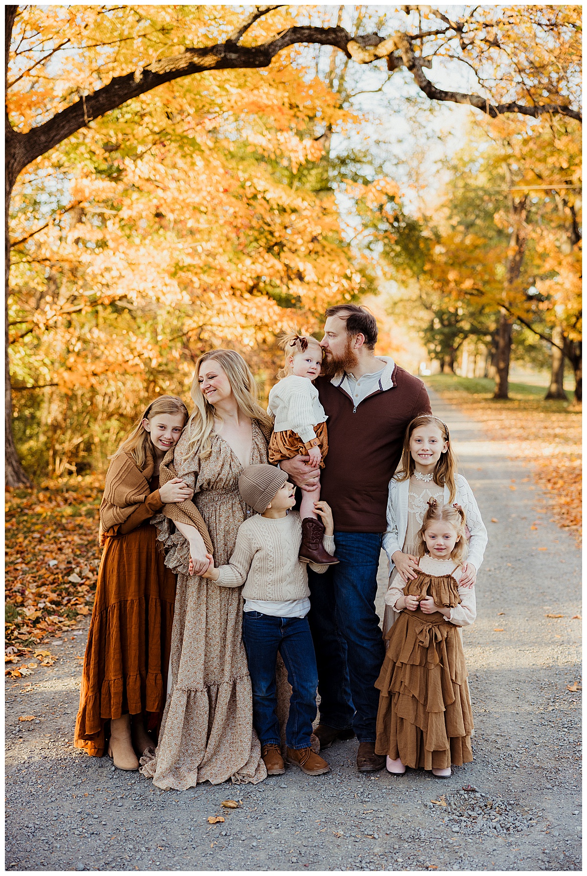
1. The Classic Autumn (Most Popular)
| Main Colors | Accent Colors | Neutrals | Best For |
|---|---|---|---|
| Burgundy, Forest Green | Burnt Orange, Gold | Cream, Tan | Traditional families, outdoor settings |
This is the palette that works for literally everyone. I've never seen it fail. The deep, rich colors photograph beautifully and make everyone's skin look amazing.
2. The Earthy Neutral
| Main Colors | Accent Colors | Neutrals | Best For |
|---|---|---|---|
| Camel, Olive Green | Mustard Yellow | Cream, Light Gray | Modern families, minimalist aesthetic |
Perfect if you want your photos to feel timeless and sophisticated. These colors age well and look great in any home decor.
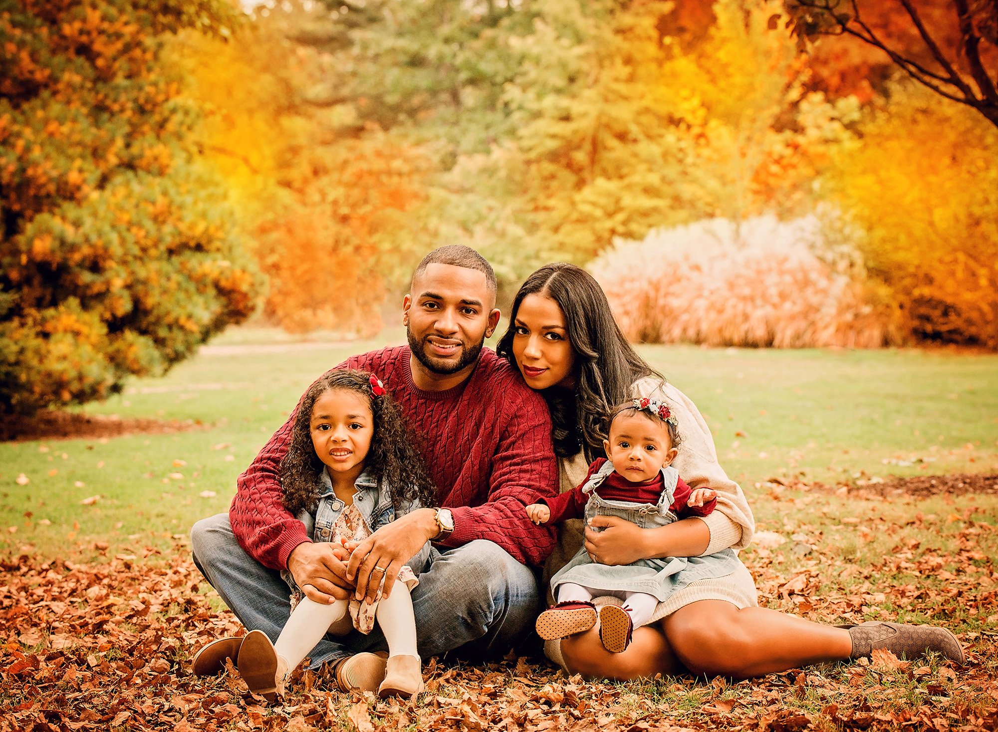
3. The Jewel Tone Statement
| Main Colors | Accent Colors | Neutrals | Best For |
|---|---|---|---|
| Emerald, Wine | Deep Orange | Navy, Cream | Families who want drama and richness |
This palette photographs incredibly well and creates that magazine-worthy look. Just be careful not to go too bold – you want elegant, not overwhelming.
4. The Denim Foundation
| Main Colors | Accent Colors | Neutrals | Best For |
|---|---|---|---|
| Denim Blue, Rust | Mustard, Deep Red | White, Tan | Casual families, kids who love jeans |
Denim is incredibly versatile and works with almost every fall color. Plus, kids actually want to wear jeans, which makes your life easier.
5. The All-Neutral Sophisticate
| Main Colors | Accent Colors | Neutrals | Best For |
|---|---|---|---|
| Taupe, Soft Gray | Blush, Sage | Cream, White | Elegant families, studio-like outdoor shots |
When you want the focus entirely on your family's faces and expressions, neutrals are your best friend.
Real Talk: What Actually Happens When You Get This Right
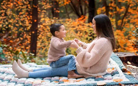
My neighbor Jessica used the Classic Autumn palette for her family photos last year. She told me she was skeptical at first – "Won't we blend into the trees?" But when she got the photos back, she couldn't stop staring at them. Her husband, who usually looks washed out in photos, looked healthy and vibrant. Her teenage daughter, who hates having her picture taken, actually loved how she looked. And their toddler's rosy cheeks popped against the burgundy sweater.
"For the first time ever, we all look like we belong in the same family photo," she said. "Not like random people who happened to be standing together."
That's the power of getting your color palette right.
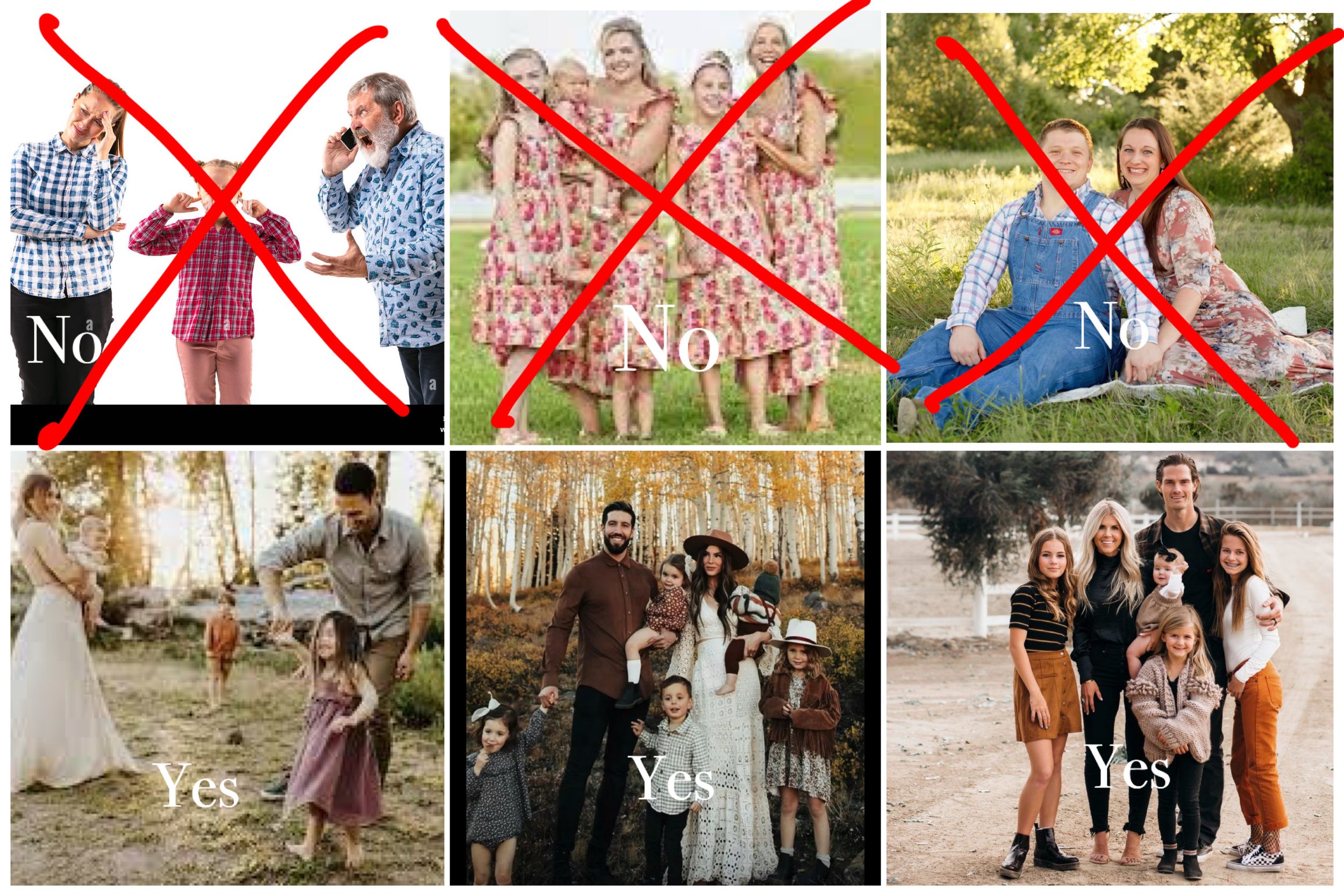
The Coordination Game: How to Make Everyone Look Amazing Without Looking Identical
Here's where most families go wrong: they either make everyone wear the exact same thing (hello, awkward matching sweaters) or they let everyone wear whatever they want and end up with chaos.
The sweet spot is coordination, not matching. Here's how to nail it:
The Mom-First Rule
Start with mom's outfit. Seriously. Choose something that makes you feel confident and beautiful, then coordinate everyone else around that. You're probably going to be in the center of most shots anyway, so you might as well be the anchor.
The Three-Variation Strategy
Once you have your color palette, assign each family member a different "version" of it:
- Person 1: Mostly neutrals with one accent color
- Person 2: One main color with neutral accessories
- Person 3: Mix of two main colors
- Person 4: Different shade of the same color family
The Texture Factor
Don't forget about textures! Mixing knits, denim, corduroy, and smooth fabrics adds visual interest and keeps things from looking flat. Plus, textures photograph beautifully in natural light.
What Professional Photographers Actually Want You to Know
I talked to several family photographers about what really makes fall photos pop, and they all said the same things:
Avoid These Color Mistakes
- Bright neon colors: They clash horribly with fall foliage
- All dark colors: You'll disappear into shadows
- Busy patterns everywhere: One subtle pattern per family, max
- White everything: It washes people out against colorful backgrounds
The Lighting Consideration
Fall photos are usually taken during golden hour, which means warm, soft lighting. Colors that work well in this light include deep reds, rich browns, olive greens, and warm neutrals. Cool blues and purples can look muddy unless they're very deep jewel tones.
Age-Specific Color Strategies
Let's be real – what works for your teenager might not work for your toddler. Here's how to adapt your color palette for different ages:
Babies and Toddlers (0- years)
- Stick to soft, neutral versions of your main colors
- Avoid anything too bright that will overpower their little faces
- Choose comfort over everything – a cranky baby in a beautiful outfit still equals a cranky baby
School-Age Kids (4- years)
- Let them have some input within your color palette
- Incorporate their favorite color as an accent if it works
- Consider their personality – shy kids often look better in softer colors, while outgoing kids can handle bolder choices
Teenagers (13+ years)
- Give them options within your palette and let them choose
- Work with their existing style – don't try to change their whole aesthetic for one photo
- Respect their comfort level – a confident teen photographs better than a self-conscious one
The Location Factor: Making Your Colors Work With Your Setting
Where you're taking photos matters more than you might think. Here's how to adjust your color choices:
Peak Fall Foliage
When trees are at their most colorful, choose colors that complement rather than compete. Deep jewel tones and rich neutrals work best.
Early Fall (Still Green)
When leaves are just starting to change, you can go bolder with oranges and reds since nature isn't showing off yet.
Late Fall (Mostly Brown)
After leaves have fallen, you have more flexibility. This is when creams, emerald greens, and deeper colors really shine.
Shopping Smart: Building Your Fall Photo Wardrobe
You don't have to buy a whole new wardrobe for family photos. Here's how to shop smart:
Investment Pieces
- One beautiful sweater in your main color for mom
- A classic cardigan in a neutral tone
- Good jeans for everyone (they work with almost any palette)
Accessory Magic
Sometimes all you need is the right scarf, hat, or boots to pull a look together. Accessories are also great for adding pops of your accent colors without overwhelming the outfit.
Real Family Success Stories
The Miller family used the Earthy Neutral palette last fall. Mom wore a camel-colored sweater, dad wore olive green, their 8-year-old chose mustard yellow, and the baby wore cream. The result? Photos that looked effortlessly coordinated and absolutely stunning against the golden fall trees.
The Johnsons went with Jewel Tone Statement colors. Everyone was nervous about the bold choices, but the deep emerald and wine colors made their photos look like they belonged in a magazine. "People keep asking us if we hired a stylist," mom told me.
Frequently Asked Questions
Q: What if my family hates the colors I choose?
Start with colors that already exist in everyone's wardrobe. Most people already own something in navy, denim, cream, or burgundy. Build from there and give everyone some choice within your palette.
Q: How far in advance should I plan outfits?
At least two weeks. This gives you time to shop for missing pieces, try things on, and have backup options if something doesn't work.
Q: What if the weather doesn't cooperate?
Always plan for layers. Cardigans, jackets, and scarves can be added or removed as needed, and they often make photos more interesting anyway.
Q: Can we include our dog in the photos?
Absolutely! Consider a coordinating bandana or collar in one of your accent colors. Just make sure it doesn't clash with your overall palette.
Q: What about shoes?
Shoes should be neutral or match one of your main colors. Avoid bright white sneakers or shoes that will draw attention away from faces.
Q: How do I coordinate with extended family?
Share your color palette in advance and ask everyone to choose one main color plus neutrals. Don't try to control every detail – just give clear guidelines.
The Bottom Line
Here's what I want you to remember: the best fall family photos happen when everyone feels comfortable and confident in what they're wearing. Yes, color coordination matters, but it's not worth a family meltdown.
Choose a palette that works for your family's style and personality. Don't force anyone into colors they hate just because they're "perfect for fall." The goal is photos where everyone looks like the best version of themselves, not like they're wearing costumes.
Start with one of the five palettes I've shared, adapt it to your family's needs, and remember that confidence is the best accessory you can wear.
Your future self will thank you when you're looking at these photos years from now, remembering not just how beautiful you all looked, but how happy you felt taking them.
Now I'm curious: what's been your biggest family photo outfit disaster, and what color palette are you most excited to try this fall?